Introduction
Having a date picker that is simple, intuitive and consistent may be necessary to ensure users have a good experience using your web application.
Building a date picker in React is more difficult than it looks. Even a simple calendar that lets users choose a date is fairly difficult to build from scratch. Task gets especially difficult when you want to include advanced features like selecting a range of dates.
Fortunately, the React community has come up with various libraries that provide easy-to-use, customizable, and consistent date pickers for your projects.
In this article, we’ll show you how to implement a date picker using the ‘react-datepicker’ library and how to customize the date picker’s appearance and functionality for your use case.
react-datepicker is a lightweight library with a lot of features.
To build a simple React date picker, all you need to do is import the custom component and set two props. Advanced features require only a little more time.
Create a Datepicker
Setup
In this article, we’ll use react-datepicker in a live environment CodeSandbox.
You can use npm to install the package in an existing project:
npm install react-datepicker
Once installed, import the custom DatePicker component in the file where you want to use it.
import DatePicker from 'react-datepicker'
You also need to import CSS styles to display elements in all their beauty.
import 'react-datepicker/dist/react-datepicker.css'
Create a basic date picker
DatePicker is a controlled component. In other words, the selected date is stored in the state and the date picker gets its value from the state. So we need to initialize the state.
In class components, we initialize a state object and use the setState() method to update it.
In functional components, we have the useState() hook that creates a state variable and the function to update it. In this case, a state variable will hold the selected date.
The react-datepicker library exports a custom component by default. When you import it, you can choose any name you want. In this case, we named it DatePicker.
Every DatePicker component must have at least two props to work:
- selected - set to the selected date, stored in the state. It is similar to value prop on
**<input>**elements. - onChange - set to a callback function with one argument, which stands for the date selected by the user. The function body should call the updater function returned by the useState hook to update the state.
import React, { useState } from "react";
import DatePicker from "react-datepicker";
export default function App() {
  const [date, setDate] = useState(new Date());
  return (
    <div>
      <DatePicker selected={date} onChange={(date) => setDate(date)} />
    </div>
  );
}

As simple as that, users can select a date. Try it yourself on CodeSandbox.
Implement Common Features
Set initial date
In class components, you set a default date when the state object is initialized.
In functional components, we can set a default date by passing a date value as an argument to the useState() hook. For example, useState(new Date()) will set it to today (the current date).
Sometimes it’s better to have no default date at all. You can add a placeholder text to help users pick the right date. Simply set the placeholderText prop on the custom component.
When the user picks a date, the onChange event handler will update the state.
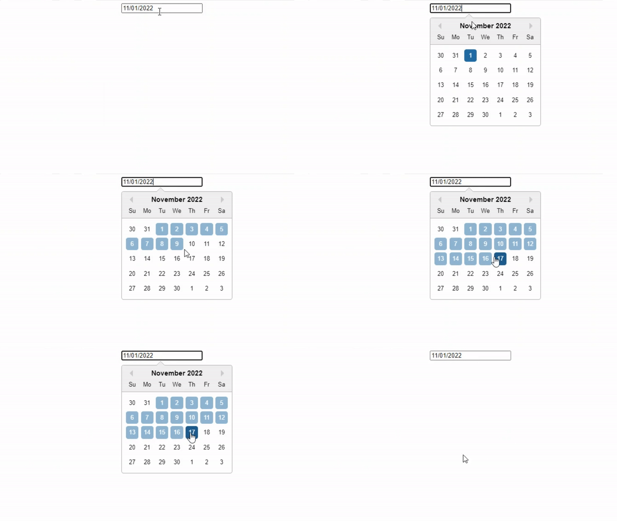
Select a range of dates
Selecting a range of dates is a very common and useful feature - for booking accommodation, a round-trip, or any other purpose.
Select range within one component
By default, one DatePicker component selects a single date value.
import React, { useState } from "react";
import DatePicker from "react-datepicker";
export default function App() {
  const [date, setDate] = useState(new Date());
  return (
    <div>
      <DatePicker selected={date} onChange={(date) => setDate(date)} />
    </div>
  );
}
You can modify the event handler to select a range of dates. The function will accept an array of two values - startDate and endDate and select the dates between them.
So far we’ve only created one state variable. So our component is not equipped to store two dates. We need to create new startDate and endDate state variables to store the beginning and end of the range of dates. We’ll also create functions to update them.
import React, { useState } from "react";
import DatePicker from "react-datepicker";
export default function App() {
  const [date, setDate] = useState(new Date());
  const [startDate, setStartDate] = useState()
  const [endDate, setEndDate] = useState()
  return (
    <div>
      <DatePicker selected={date} onChange={(date) => setDate(date)} />
    </div>
  );
}
We’ll need to change the event handler as well. When users select a range of values, the argument passed to the function won’t be a single value - but an array of two dates.
We need to destructure the array to get both the start and end of the range. Then we can update their corresponding state variables.
import React, { useState } from "react";
import DatePicker from "react-datepicker";

export default function App() {
  const [date, setDate] = useState(new Date());
  const [startDate, setStartDate] = useState();
  const [endDate, setEndDate] = useState();

  const handleChange = (range) => {
    const [startDate, endDate] = range;
    setStartDate(startDate);
    setEndDate(endDate);
  };

  return (
    <div>
      <DatePicker selected={date} onChange={handleChange} />
    </div>
  );
}
When selecting a single date, it was possible to write an inline event handler, like so:
import React, { useState } from "react";
import DatePicker from "react-datepicker";
export default function App() {
  const [date, setDate] = useState(new Date());
  return (
    <div>
      <DatePicker selected={date} onChange={(date) => setDate(date)} />
    </div>
  );
}
Selecting a range of dates makes handleChange a bit more complex, so it can’t be an inline event handler. You’ll need to define it outside the tsx and reference it as the value of the onChange prop.
import React, { useState } from "react";
import DatePicker from "react-datepicker";

export default function App() {
  const [date, setDate] = useState(new Date());
  const [startDate, setStartDate] = useState();
  const [endDate, setEndDate] = useState();

  const handleChange = (range) => {
    const [startDate, endDate] = range;
    setStartDate(startDate);
    setEndDate(endDate);
  };

  return (
    <div>
      <DatePicker selected={date} onChange={handleChange} />
    </div>
  );
}
Next, we need to add startDate, endDate, and selectsRange props to the custom component.
Set startDate and endDate props to their respective state values. selectsRange is simply a boolean prop.
import React, { useState } from "react";
import DatePicker from "react-datepicker";

export default function App() {
  const [date, setDate] = useState(new Date());
  const [startDate, setStartDate] = useState();
  const [endDate, setEndDate] = useState();

  const handleChange = (range) => {
    const [startDate, endDate] = range;
    setStartDate(startDate);
    setEndDate(endDate);
  };

  return (
    <div>
      <DatePicker
        selected={startDate}
        onChange={onChange}
        startDate={startDate}
        endDate={endDate}
        selectsRange
    />
    </div>
  );
}
Using two separate components
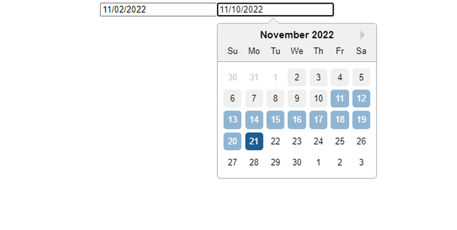
You can also use two DatePicker components to select the range. One component will select the start, and another the end.
We still need to create state variables startDate and endDate.
Let’s say the first component selects a start date. Set the selectsStart prop to specify its purpose. Set selected and startDate props to values from the state, and onChange to a simple handler that updates the startDate state variable.
import React, { useState } from "react";
import DatePicker from "react-datepicker";

export default function App() {
  const [date, setDate] = useState(new Date());
  const [startDate, setStartDate] = useState();
  const [endDate, setEndDate] = useState();

  return (
    <div>
      <DatePicker
        selectsStart
        selected={startDate}
        onChange={date => setStartDate(date)}
        startDate={startDate}
      />
    </div>
  );
}
Next, we need a second DatePicker component with a selectsEnd prop to specify that it selects the end of the range.
The component should get its values from the state. So selected and endDate props should be set to the endDate state variable. The onChange function should update the endDate state variable.
import React, { useState } from "react";
import DatePicker from "react-datepicker";

export default function App() {
  const [date, setDate] = useState(new Date());
  const [startDate, setStartDate] = useState();
  const [endDate, setEndDate] = useState();

  return (
    <div>
      <DatePicker
        selectsStart
        selected={startDate}
        onChange={date => setStartDate(date)}
        startDate={startDate}
      />
      <DatePicker
        selectsEnd
        selected={endDate}
        onChange={date => setEndDate(date)}
        endDate={endDate}
        startDate={startDate}
        minDate={startDate}
     />
    </div>
  );
}
The React date picker that selects the end should have a startDate prop as well.
Also, have the minDate prop set to the start date. This will ensure that users can’t select an end date that comes earlier than the start date.
Select time
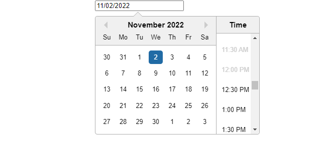
Allow users to select both date and time by adding the showTimeSelect prop to your DatePicker.
This could be a useful use case for booking appointments or meetings.
showTimeSelect will allow users to select time intervals (9:00, 9:30, 10:00, etc). Set the timeIntervals prop to show 15-minute or 5-minute intervals instead.
minTime and maxTime props allow you to disable times before or after a certain time.
For example, set minTime to 12:30, and maxTime to 19:00. Users will only be able to select times from 12:30 to 7 pm.
import React, { useState } from "react";
import DatePicker from "react-datepicker";

export default function App() {
  const [date, setDate] = useState(new Date());

  return (
    <div>
      <DatePicker
        showTimeSelect
        minTime={new Date(0, 0, 0, 12, 30)}
        maxTime={new Date(0, 0, 0, 19, 0)}
        selected={date}
        onChange={date => setDate(date)}
      />
    </div>
  );
}
Set the dateFormat prop to display both date and time within the field.
For example:
import React, { useState } from "react";
import DatePicker from "react-datepicker";

export default function App() {
  const [date, setDate] = useState(new Date());

  return (
    <div>
      <DatePicker
        showTimeSelect
        minTime={new Date(0, 0, 0, 12, 30)}
        maxTime={new Date(0, 0, 0, 19, 0)}
        selected={date}
        onChange={date => setDate(date)}
        dateFormat="MMMM d, yyyy h:mmaa"
      />
    </div>
  );
}
If you want users to enter their own time instead of selecting it, replace the showTimeSelect with the showTimeInput boolean prop.

Conditionally disable dates
Use filterDate prop to conditionally disable dates in the calendar. Set its value to a callback function that returns a condition.
Users will be able to select only dates that meet the condition. Dates that do not meet the condition will be disabled.
For example, here’s a function that returns false for dates less than (earlier than) today, and true for higher (later) dates.
You can similarly check if the date is a weekend, a weekday, or a holiday, or disable dates based on any other condition.
import React, { useState } from "react";
import DatePicker from "react-datepicker";

export default function App() {
  const [date, setDate] = useState(new Date());

  const weekend = (date) => new Date() < date;

  return (
    <div>
      <DatePicker
        showTimeSelect
        filterDate={weekend}
        selected={date}
        onChange={date => setDate(date)}
      />
    </div>
  );
}
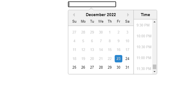
For example, you might want to disable past dates so users can’t select them when booking accommodation or flights.
You can also use minDate and maxDate props to disable all dates before or after a certain date.
filterTime prop allows you to conditionally disable time values. For example, disable out-of-office hours.
Other options
Let’s see how to implement various other features.
className
You can set className to customize the appearance of the custom DatePicker component.
calendarClassName
You can use the calendarClassName prop to customize the appearance of the calendar itself. Increase font size, padding, background color, etc.
highlightDates
Set the highlightDates prop to an array of date values that should be highlighted.
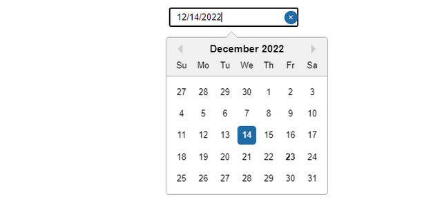
isClearable
Simply add the isClearable prop to the date picker to display a button to reset the selected date.
locale
Use the locale prop to specify the date locale. For example, use English (British) instead of the default US locale.
dayClassName
dayClassName prop allows you to customize the appearance of each day in the calendar.
You can pass it a callback function that returns a ternary operator. dayClassName will apply the className only if the day meets a condition.
timeClassName
This prop allows you to customize the appearance of time selections.
Set the timeClassName prop to a callback function that returns a ternary operator. It will apply the className value if the time meets a condition.
dateFormat
The value of the dateFormat prop specifies the format of date values.
minDate
Set the minimum date, all dates earlier than minDate will be disabled.
excludeDates
Set excludeDates prop to an array of date values that should be excluded. All other dates will be included.
includeDates
Set includeDates prop to an array of date values that should be included. All other dates will be excluded.
excludeDateIntervals
Set the value of the excludeDateIntervals prop to an array of objects with two properties: start and end. The array can have multiple intervals. All dates outside of intervals will be included.
includeDateIntervals
Just like the previous prop, the value of includeDateIntervals should be an array of objects (intervals) with two properties: start and end.
Date intervals specified in the array will be included. All dates outside of these intervals will be disabled.
disabled
Add this boolean prop to disable your datepicker. It works similarly to HTML elements’ disabled attribute.
shouldCloseOnSelect
By default, the calendar closes when the user selects a date. If you want the calendar to stay open, set the shouldCloseOnSelect prop to true.
showMonthDropdown and showYearDropdown
Sometimes users need to select dates far ahead of time. showMonthDropdown and showYearDropdown props allow users to select dates from specific months or years in the future.
showMonthYearPicker
Allow users to pick months and years instead of specific dates.
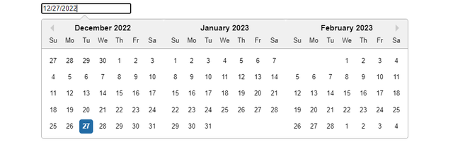
monthsShown
By default, a date picker shows a calendar where users can select a date. Use the monthsShown prop to specify the number of months that should display simultaneously. For example, setting monthsShown to 3 will allow users to select dates (or ranges) from 90 days.
Conclusion
Date pickers are sometimes a web application’s most important feature. In this article, we showed how to create basic React date picker using react-datepicker package, implementing advanced features and their possible use cases.
Hopefully our article has helped you make best use of the ‘react-datepicker’ package to create datepickers in a short time.
